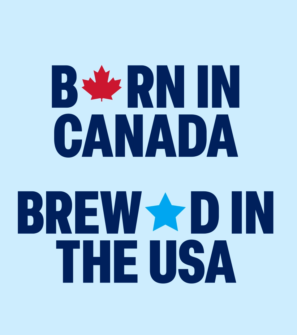
BORN IN CANADA, BREWED IN THE USA
A Canadian icon since 1847, Labatt has long held a unique place in the U.S. beer market. With production for the American market now taking place in New York, the opportunity was to celebrate both sides of the brand's story rather than choose between them.
Instead of seeing that dual identity as a contradiction, we made it the foundation of a refreshed brand story - one that embraces Labatt's Canadian heritage while confidently celebrating its place in American culture.
PROVOKE THE BOND
Rather than just trying to make Labatt feel “more Canadian,” we identified a more ownable cultural territory: the beer of friendly rivalry. Because nobody understands friendly rivalry better than neighbors.
As dual citizens, Labatt has permission to champion the epic friendly rivalry between the USA and Canada, while fueling the friendly rivalries that bring people together across all walks of life. That created a broader cultural role for Labatt rooted in playful banter, competition, and connection.
We built robust strategic foundations around this unlock that set Labatt up to stand out as the domestic beer that tastes like an import… because sorry, but Canadian-born beer just tastes better.
BEST FRENEMIES FROM THE NORTH
Our big creative idea was born from this celebration of friendly rivalry across borders. While Canada and the USA share a great deal, it's our differences—and the playful banter they inspire—that keeps the bond alive and the relationship fresh and fun.
Our creative principles bring this idea to life, and guide how Labatt shows up in the world: Unapologetically Canadian-Born, Playful Provocation, Uniting Differences, and Steal-Worthy Swagger. Together, they give Labatt a more confident personality and a distinctive way of showing up across packaging, communications, and the wider brand experience.
BRING IT ON
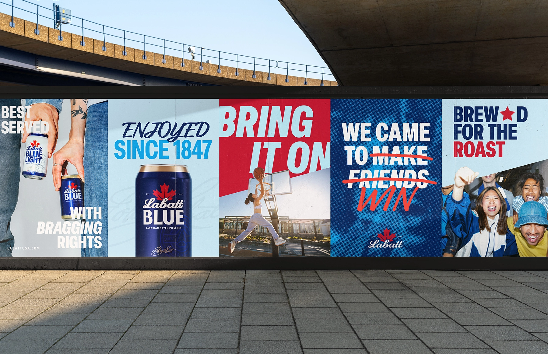
We then translated that creative idea into a visual and verbal identity and pack system that brings standout provocation with playful warmth.
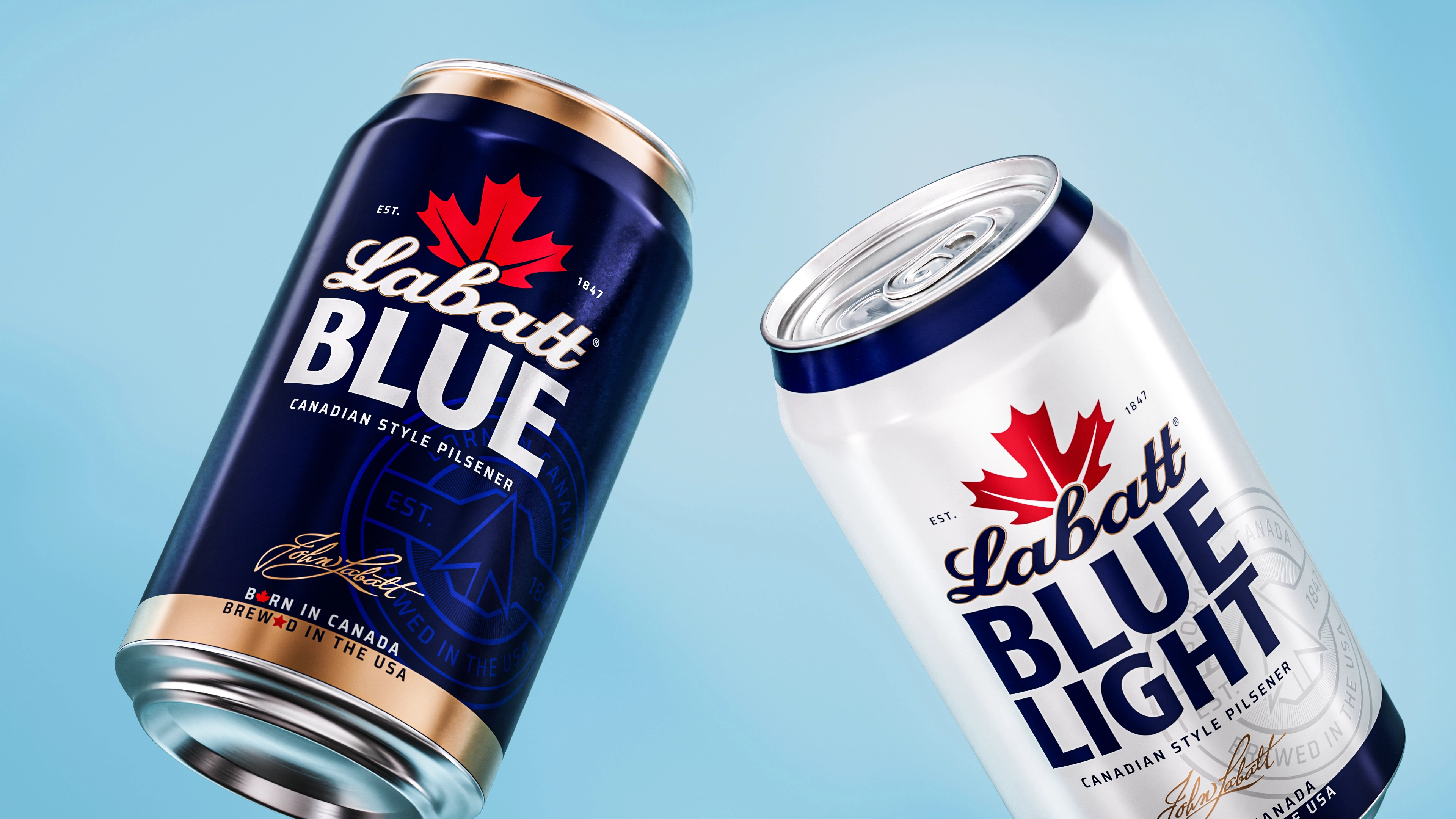
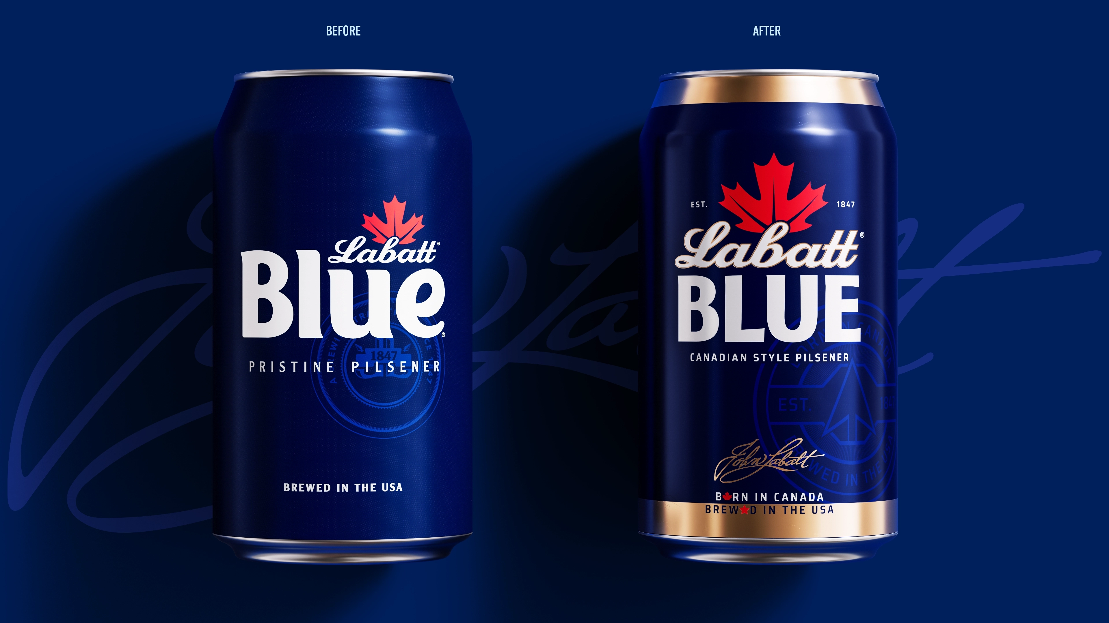
Starting with the logo, the maple leaf and script were widely recognized. The issue was that over time, the masterbrand had faded while "Blue" became the thing consumers remembered (even the bar call was ‘Blue’ rather than ‘Labatt!). We re-crafted the logo and hierarchy to make the Labatt name and its proud Canadian roots the hero again, without sacrificing the longstanding equity.
We also built out a suite of graphic assets in their visual identity to elevate their beers, tell their story, and bring fresh edge with stopping power.
Some of these assets - like the John Labatt signature and northward-pointing arrow - were long-forgotten legacy assets we found in the brands’ vast archives, which we re-crafted and infused with meaning for today.
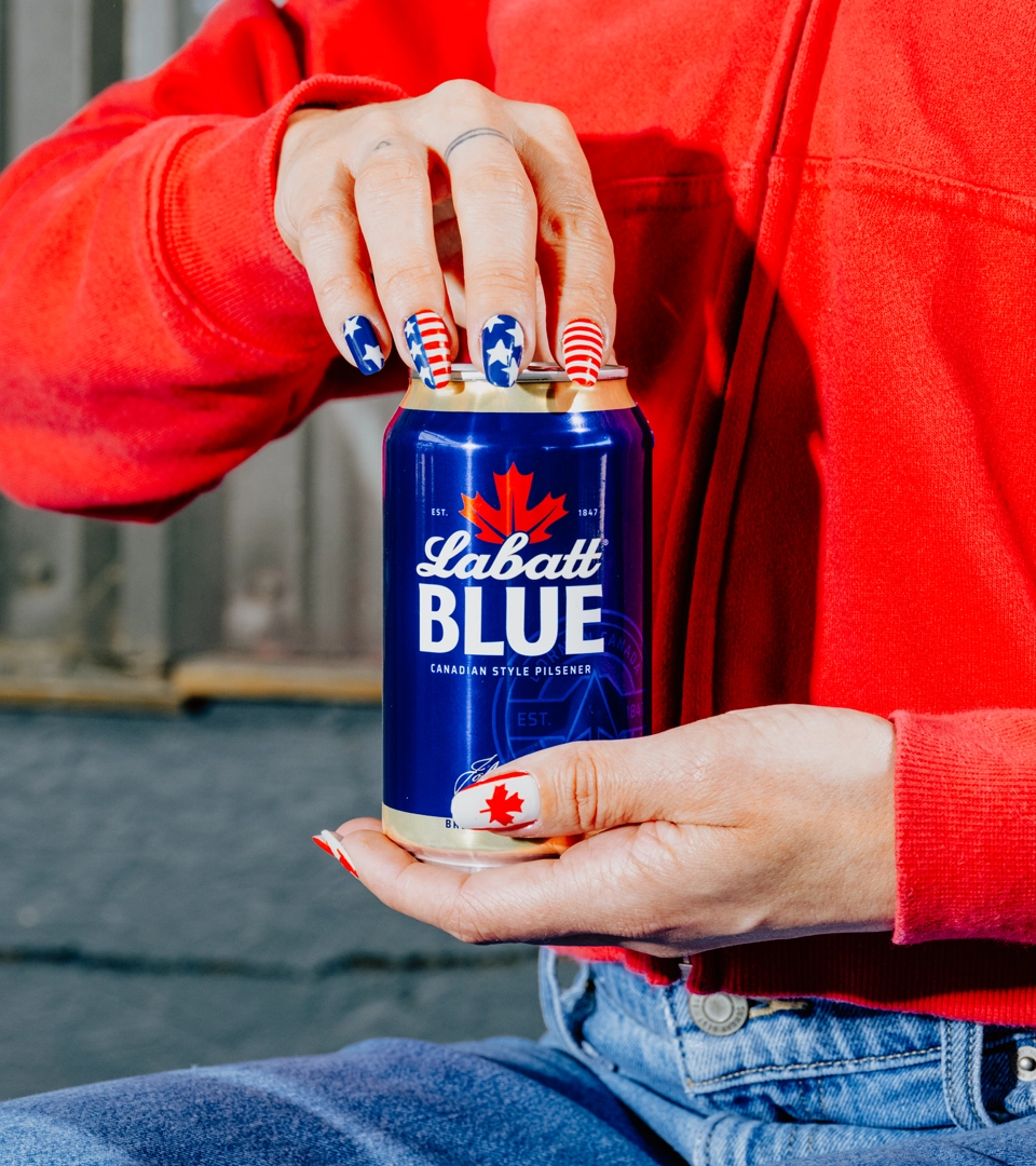
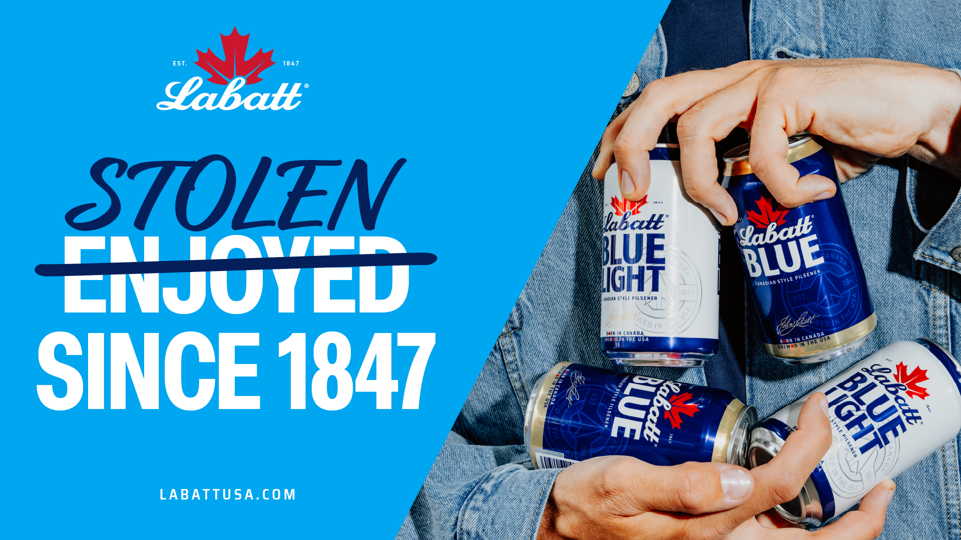
We also introduced new graphic elements—including bold hijacked typography, star and maple leaf iconography, and a dynamic diagonal device—to create a distinctive system inspired by border-breaking connection, and playful competition.
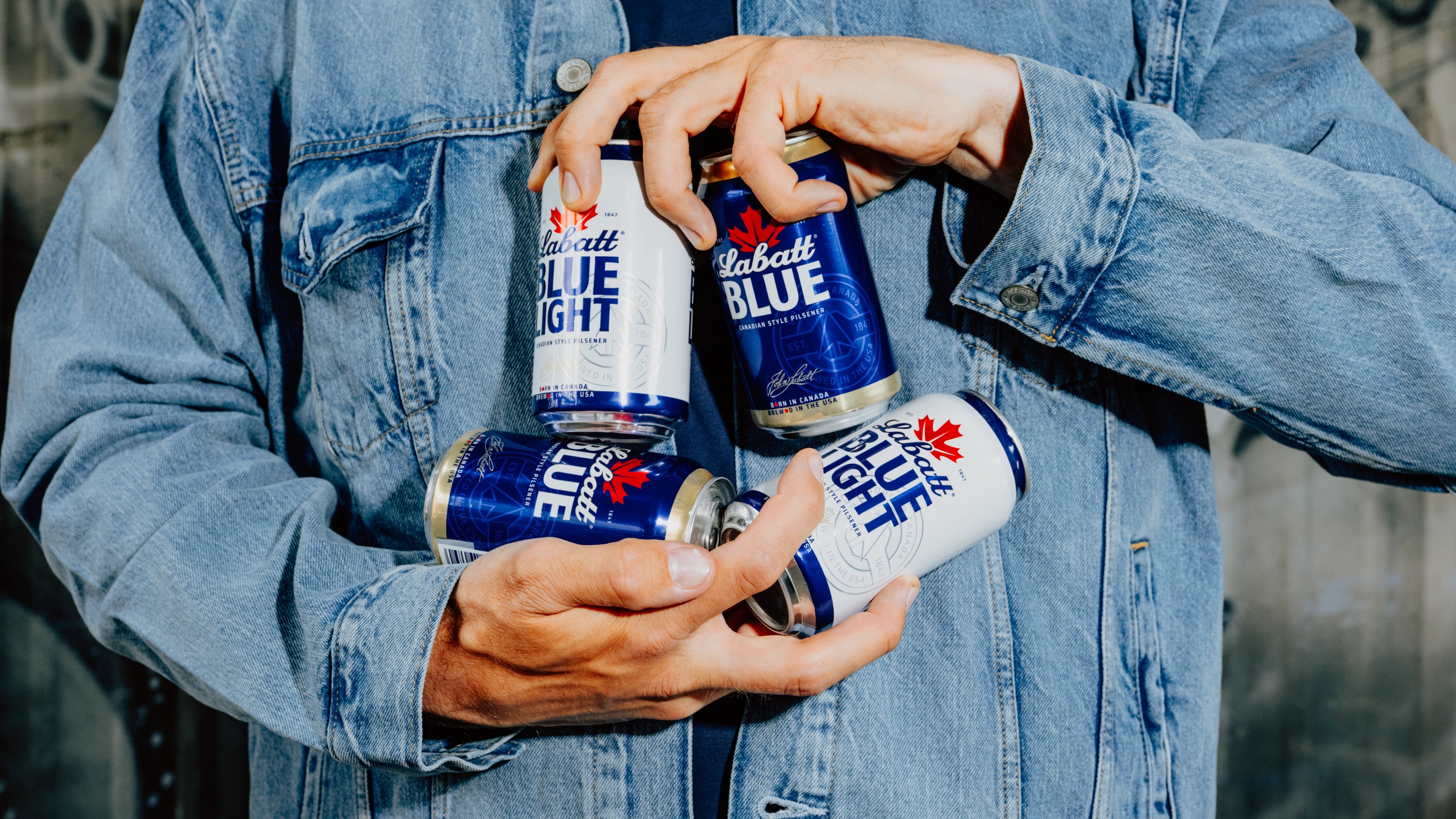
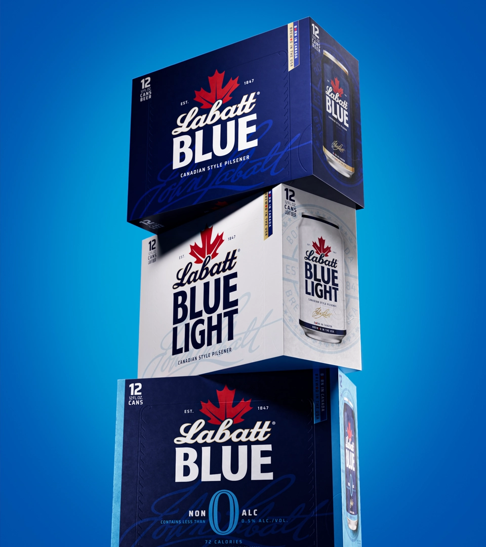
Our refreshed pack system unified the portfolio around this louder, prouder Labatt. Along with the bigger, prouder wordmark and more cohesive varianting, we incorporated elevated details like the gold John Labatt signature and a watermarked seal to bring in some understated swagger that’s truly steal-worthy.
The identity extends beyond packaging through a visual language built around borders, contrast and playful provocation—celebrating what makes neighbors different while reminding us why we get along. From backyard cookoffs to tailgates and cornhole tournaments, we put Labatt in the center of friendly rivalries that bring people together across all walks of life.
BEST SERVED WITH BRAGGING RIGHTS
Launched in May 2026, Labatt’s refreshed identity and packaging system celebrates the brand’s unique dual citizen story with standout confidence and swagger. Proudly Canadian-born and brewed in the USA, the next chapter gives one of North America’s most iconic beer brands a fresh new way to express what has always made it distinctive, and sparking some heated friendly rivalries on the way.