Niteswim:
SOAK IT UP, TAKE A PAUSE

Entrepreneur Amy Schmidt created Niteswim’s first herbal bath salt blends in her Brooklyn kitchen, combining magnesium-rich salts with healing botanicals to offer moments of rest and replenishment.
To match the quality of her formulations, she needed a brand that could connect emotionally with an underserved middle-age audience, balance luxury with sustainability, and build an identity and packaging system flexible enough to grow into new products, categories and channels.
01. ILLUMINATION: The Messy Middle
We pay a lot of attention to the extremes of life—caring for the generations before and after us. Yet middle age is filled with its own unique challenges and opportunities: shifting physical and emotional needs, growing responsibilities, changing relationships and the constant pressure to keep everything moving.
It’s also a life stage that wellness brands often either ignore or reduce to a problem that needs fixing.
Niteswim offered a different perspective.Rather than promising optimization, anti-aging or transformation, it could offer something more human: permission to pause. Because sometimes the best reaction to a difficult situation is simply to do nothing for a while. To step away, sink in and let the water do its work.
Our challenge was to turn that emotional proposition into a brand that felt premium without being precious, sustainable without looking overtly “eco,” and sophisticated without losing a lities without defining its audience by age or treating self-care like another problem to solve.
02. REVELATION: Find Your Light in the Night
A bath is more than a functional act of self-care. It’s a moment when the noise stops, expectations disappear and you can simply be. And the name Niteswim already contained the beginnings of an evocative world to build from: slipping into water after dark; the freedom and quiet of being alone; the reflection of moonlight on a moving surface; a small escape from whatever is happening outside.
That inspired our guiding idea: Find Your Light in the Night.
Niteswim could be there for the ebbs and flows of middle age- the moments of overwhelming and transition, but also renewal, possibility and becoming.
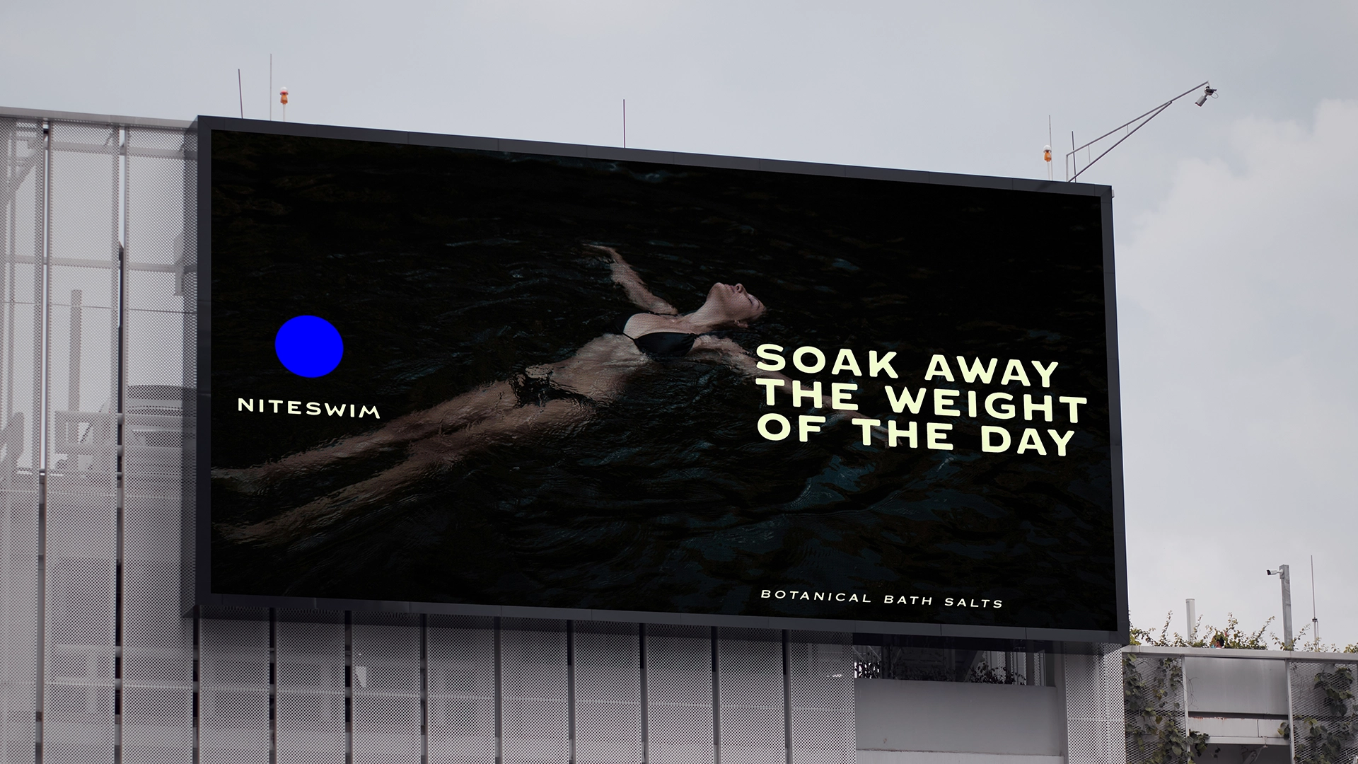
We reframed the bath as a restorative ritual: a chance to soak away the weight of the day, surrender to the water and emerge ready for whatever comes next. The idea gave us an emotional and visual world bigger than bath salts alone, built around water, night, light, movement and the transformative power of taking a pause.
03. CREATION: Making Waves
We translated that idea into a visual and verbal identity designed to feel as immersive as the ritual itself.
Amy came to us with a wonderfully specific description of her own sensibility: “Gucci Hippie,” which became an important creative filter for the brand.
Gucci brought refinement, richness and a little indulgence. Hippie brought natural materials, hand-crafted imperfection, freedom and soul. Together, they helped us find an aesthetic that could feel elevated and luxurious without becoming sterile or overly polished, and natural and sustainable without falling into the predictable visual codes of wellness.
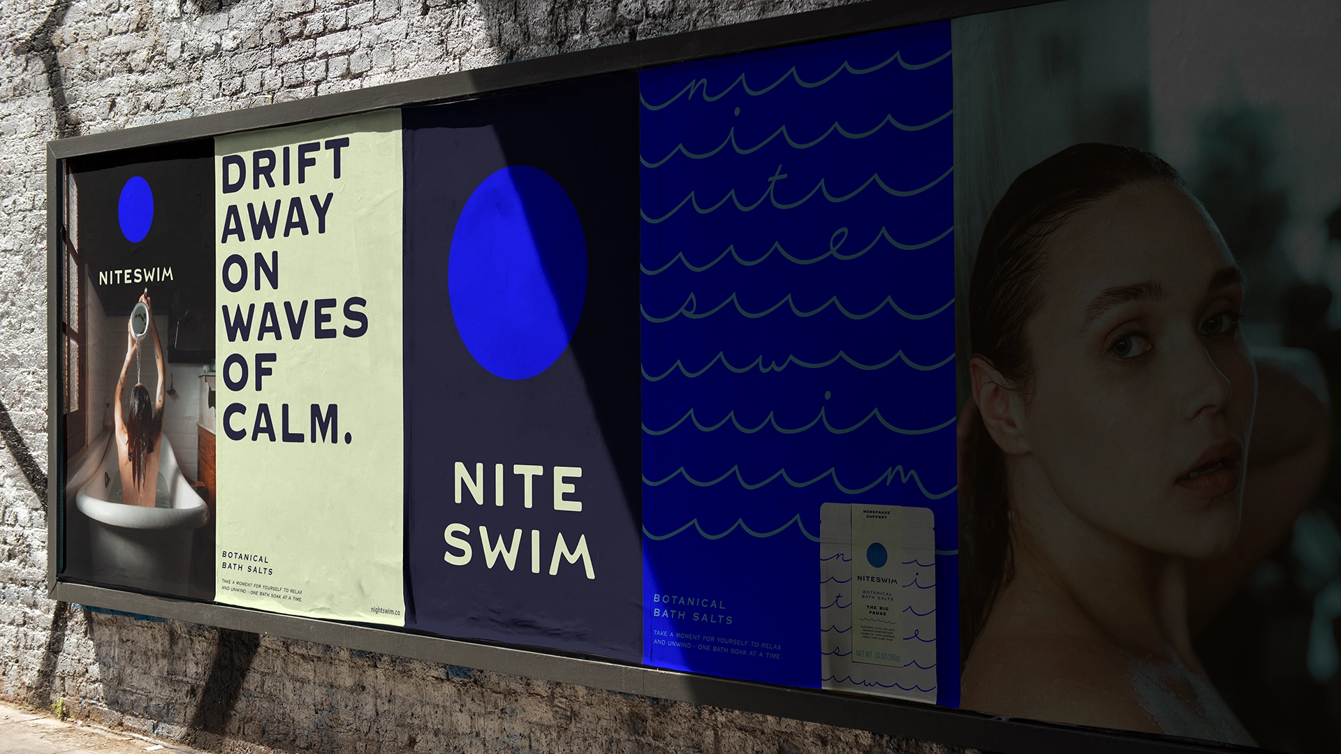
The identity draws from the relationship between moonlight and water, pairing luminous moments of light with deep, atmospheric tones and fluid forms that ripple, bend and move across the system.
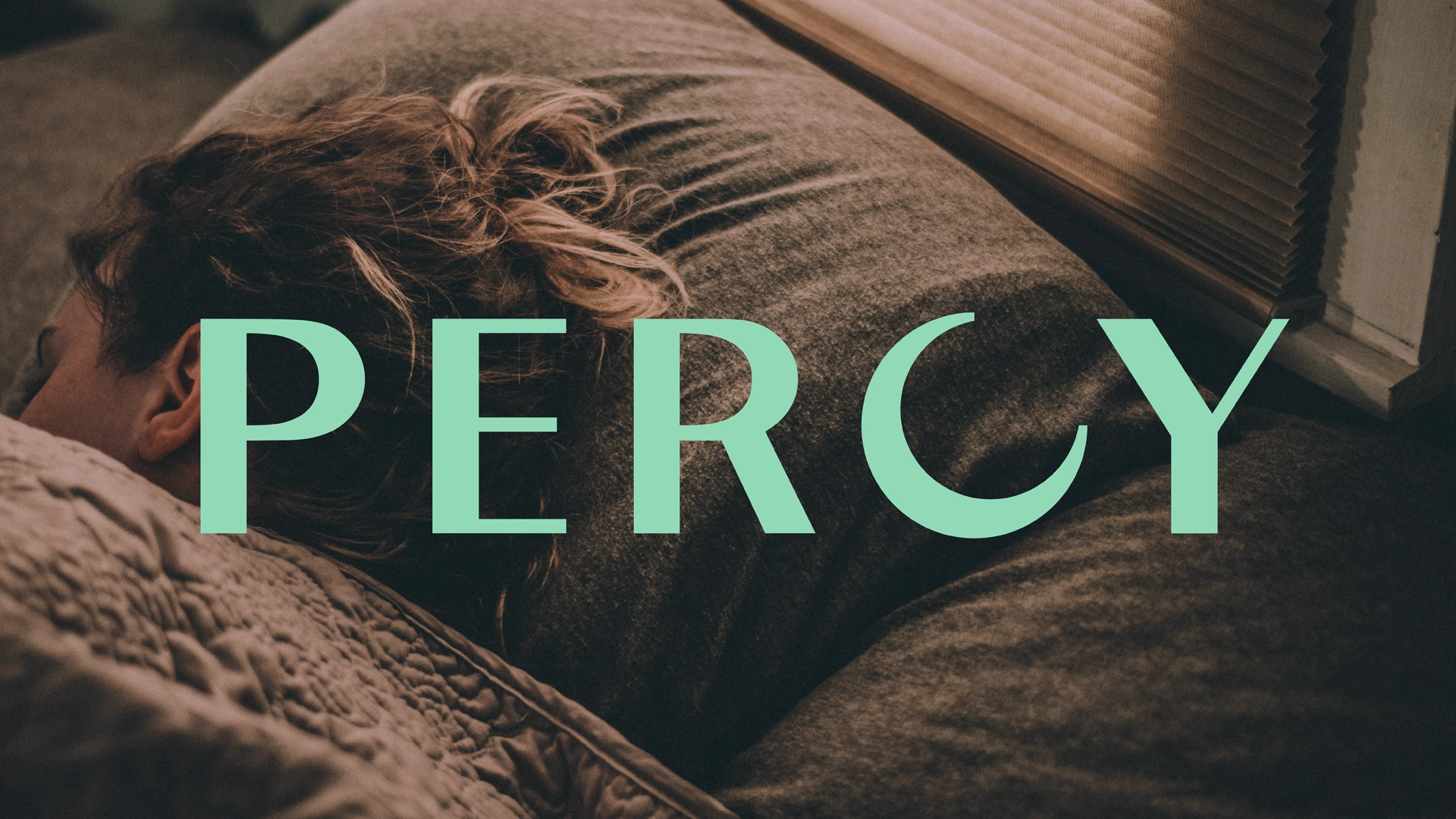
A refined wordmark inspired by the luminous relationship between moonlight and water gives Niteswim an elevated foundation, contrasted by playfully imaginative, hand-crafted elements that bring warmth and personality. Fluid graphics ripple and move across the system, while moon-inspired forms create moments of illumination, evoking the reflection of a full moon across calm water.
The packaging brings those elements together in a tactile experience designed to feel special before the bath even begins. Premium details elevate the ritual, while material and structural choices reflect the brand’s commitment to sustainability. Rather than relying on traditional wellness cues, it creates its own nighttime world that’s mysterious enough to draw you in, but warm and imaginative enough to feel inviting.
Our verbal identity strikes the same balance: thoughtful but never self-serious, with language like “Soak Away the Weight of the Day” bringing wit and lightness to real emotional needs.
Together, these elements create a world that feels tranquil but not boring, luxurious but not precious, natural but not crunchy: a refined edge for a personally meaningful ritual.
04. REALIZATION: Soak it Up, Take a Pause
From the beginning, Niteswim was designed to be bigger than a single bath salt.
We created a flexible identity and packaging architecture that creates room for new formulas, rituals and products while always returning to the same emotional promise: a moment to stop, soak and reconnect with yourself.
The core elements - wordmark, fluid graphic language, moonlit palette, handcrafted details and distinctive voice - create immediate recognition, while giving individual products enough flexibility to develop their own personality within the Niteswim world.
Launched in 2024 online, in premium boutiques and at upstate retreats, Niteswim quickly sold out of its original variants and expanded into new bath salt formulas, and bath balms. With national retail distribution in progress, the brand is moving from a Brooklyn kitchen toward a much bigger stage.
The result is a brand that reflects the contradictions of the audience it was built for: sophisticated and free-spirited, responsible and indulgent, navigating change while finding pleasure in the moment.
Because as Sylvia Plath famously said, “There must be quite a few things a hot bath won’t cure, but I don’t know many of them.”
Soak it up. Take a pause. Find your light in the night.