Art, Design and Having Something to Say
We named our studio after a rebellious artist and nun. I sometimes think about what it means to live up to that.
We named our studio after a rebellious artist and nun. I sometimes think about what it means to live up to that.
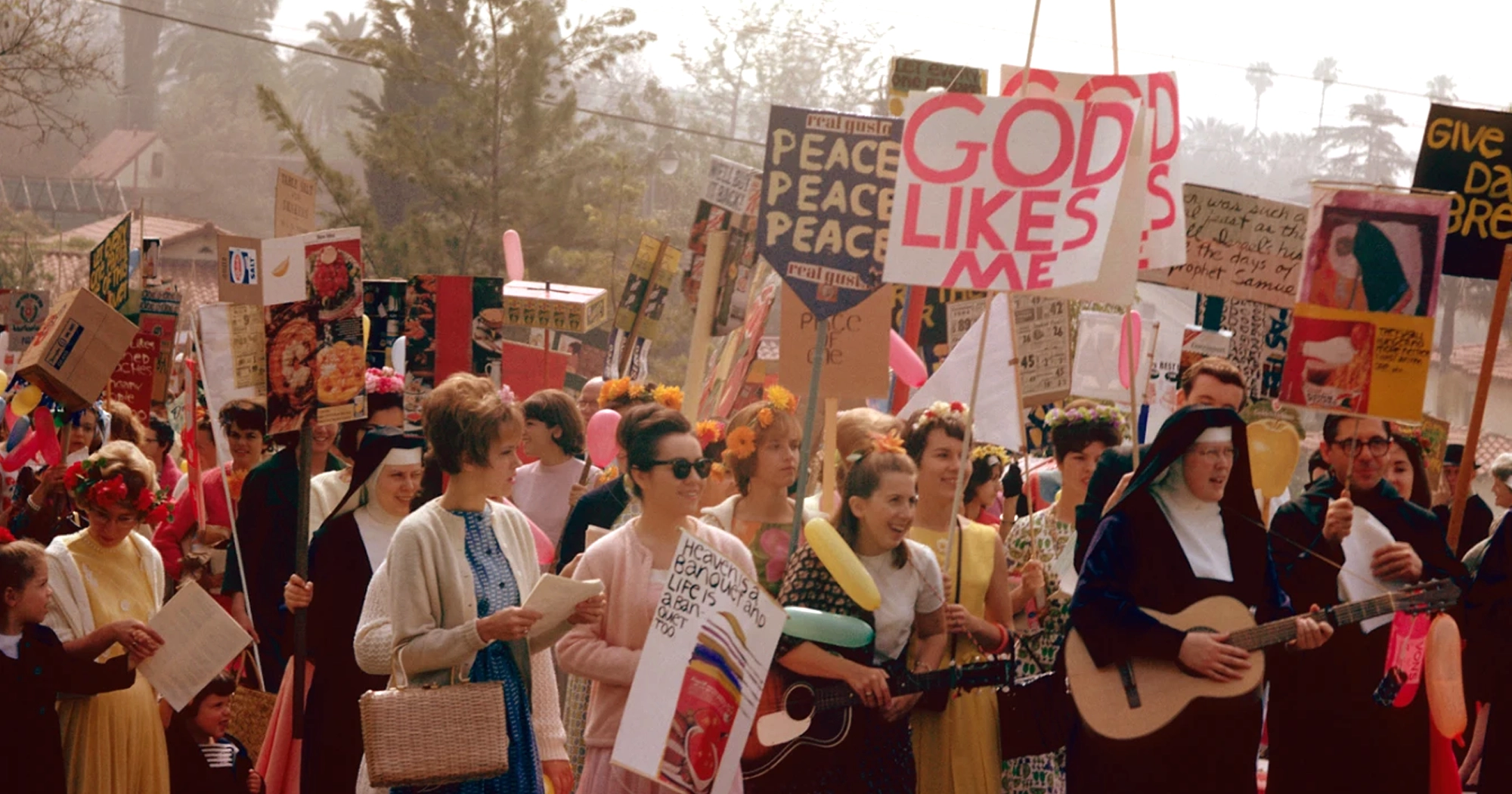
Sister Mary Corita Kent was a pop artist, educator, nun and advocate for social justice. Her work was full of riotous colour, joy and messages of hope. It also confronted poverty, racism and war, bringing her into conflict with conservative Church authorities who sought to limit her artistic activities. She found inspiration in the commercial world around her in LA: billboards, advertising slogans and supermarket packaging. She understood how they captured people’s attention and repurposed their familiar language to prompt people to question what was happening around them.
Even her choice of medium reflected her convictions; screenprinting allowed her to produce original art in multiples, making it more affordable and accessible. She thought as much about who could own and encounter her work as what it said. That’s the part of her legacy I keep returning to. How a belief can shape every creative decision, from the words on the page to the way they inspire an image that catches someone’s eye.
At Sister Mary, we spend much of our time designing brands that people want to buy. Beer, spirits, wellness, lifestyle. I love that work: the pleasure, character and imagination we can bring to everyday things. Alongside it, we’ve had opportunities to use those same skills to support ideas and organisations we believe in outside of consumer packaged goods. Those projects make us think in a more abstract way about what design can contribute, and make our consumer-facing work much stronger and bolder.
Andel: The power of coming together
For Andel, the purpose is practical. Named after the Danish word for “co-op,” it uses the power of a collective to secure lower prices for medications people struggle to reliably access. People grouping together can achieve something liberating that’s difficult to do alone. Our protest-inspired handwritten stroke gives that collective spirit a visible presence. It carries the energy of a mark made by a person with something to say. Its meaning comes from the organisation behind it: a model that challenges how things work and helps people get what they need, consistently and without pause.
The Signal: Giving dissent a physical form
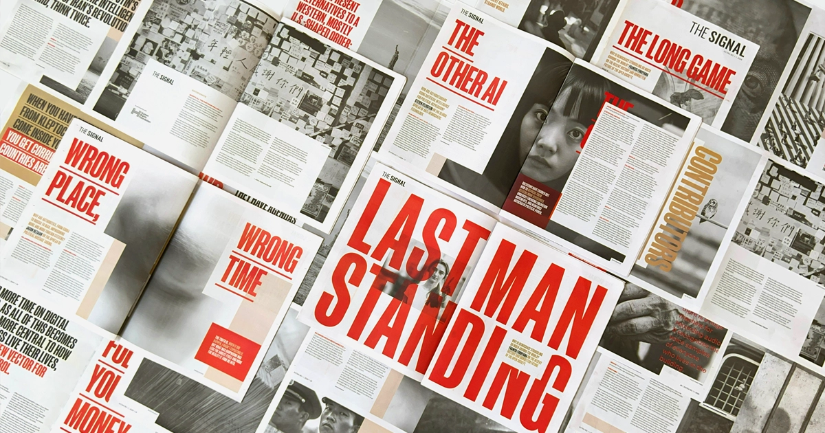
With The Signal, our work takes a more explicitly political form. We’ve partnered with the team on three physical editions exploring various topics relating to human rights, created in collaboration with the Human Rights Foundation. The design draws inspiration from samizdat, the underground publications circulated in defiance of Soviet censorship. Typewritten, copied and passed hand to hand, they gave suppressed ideas a way to travel. Their style reflects the conditions in which they were made and the urgency of sharing them.
That informed how we approached The Signal. A consistent format, base typeface and supplied wordmark connect the editions, while each subject shapes its own visual language. An issue about dictatorship and censorship uses tape, redaction and references to investigative evidence boards. Another, exploring Bitcoin and financial freedom, combines digital glitches with the familiar pink of the Financial Times.
We wanted the subject matter to be felt in the printed object itself. Each issue is a refusal to let aesthetics become background noise.
Prayer Candles: Making room for hope
Our annual Sister Mary Prayer Candles give us a different space to express what we care about. They’re personal objects, made to mark another year of the studio and celebrate the people who have helped us build it. This year’s third edition, COME ALIVE, draws on Corita’s words, “Tomorrow, the stars come alive.” Its celestial characters, references to tarot, nature and folklore, and hidden discoveries create a world we hope people will keep exploring and see something different in each time they interact with it. Making it gave us time to think about what we wanted to carry into our next year: fresh ideas, new connections and a sense of possibility. The candle holds those intentions in a form we can share. Because hope and belonging are messages worth making room for, too.

What we do with attention
I wouldn’t claim that design alone changes the world. In these projects, its contribution depends on the people, ideas and actions behind it. But it can help a purpose become recognisable, give a message emotional force and invite people to take part. Corita understood how much could be done with a familiar phrase, a bright colour and a screen-printed sheet of paper. She had convictions, and she used her skills to give them reach. Running a commercial studio, I’m still working out what following that example means. I don’t expect every project to carry a manifesto, but I do want us to stay conscious of what we’re helping to put into the world, and to use our abilities when there’s something we believe deserves to be heard.
So yes, we know how to capture attention. But the question I keep coming back to is what we want to do with it.